Art Journaling 101 - Part 2: Color Schemes and Materials
In this second part of my mini-series on what I've learned in these past years of keeping an art journal (or illustrated journal, as I like to call it), I'll focus on what I've learned about colors and materials to use.
© Anna Denise Floor
Color
As I mentioned in the first part of this tutorial, a great color scheme can really tie things together. Especially if the layout is a bit scattered, or I’m not quite sure how to tie the subject together, I’ll use a solid color scheme (or a variation of a theme) on the two facing pages.
© Anna Denise Floor
In this drawing, for example, I used the same colors on both pages, whilst keeping the subjects and the layout very separate. It really makes me like the spread better and it just feels a lot more harmonious. When I first started art journaling, I would often do this intuitively, but other times I would be horrified of how my two pretty pages looked so horrible together because of the colors I used.
So these days, before I start drawing, I try to think about what colors I want to use. What colors will play an important role in the drawing? Often, the first color is pretty obvious. On our Dutch holiday Queensday, we all dress in orange, so orange was the basis for this spread.
© Anna Denise Floor
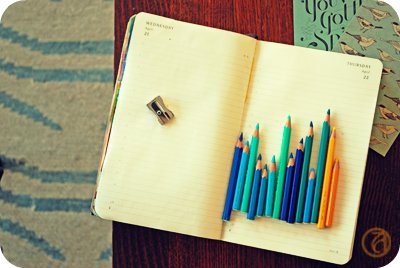
Rocket science, really. What happens next, though, usually requires some planning on my part. I will sit in front of my pencil box and look for colors I like that will match the base color I am working with. For example, I love the combination of sea green and ochre, or (like here) orange and pink. Just putting the pencils next to each other will tell me whether I think the combination would be good for this drawing.
Now, since most of my drawings are about cheerful subjects (I don’t really see the need of focusing on the negative very often), the colors will reflect this mood. Lots of blues, pinks, oranges, and yellows. For me, those are all happy colors, but perhaps this is different for you. Red, to me, often signifies stress, so I tend to use that for drawings that are about stress. It’s not always a conscious decision on my part, but it’s nice to think about what colors mean to you personally and the implication the colors in your drawings can have on the mood of the spread.
© Anna Denise Floor
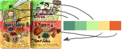
Picking a color scheme can be tricky though and after a while I notice I start to get into a pattern where I use the same color combinations over and over again. To get out of my comfort zone, I will try to find examples of other, more out of the box, color combinations. Sometimes I will look at what other artists did, look at magazines and the colors they use on one page, or I’ll check out the Kuler website for inspiration. At Kuler, you can either make your own color combinations, or just check out the gigantic database of color combinations made by other users. I really like how this can make me think differently about what colors go together.
© Anna Denise Floor
For example, for these pages, I used this Kuler color scheme. I divided the colors in the scheme over the two pages so it wouldn’t be too ‘matchy-matchy’, but made sure to put little bits of color over the two pages. For example the red text on the left matches the large red block to the left - I feel this really connects the two pages.
I know there are a lot of websites out there talking about the color wheel, color theory, etc. I took all these classes in high school and of course picked up a bit of this during my art history studies, but I think what's most important is really trying to pay attention to color combinations. Is there a favorite shirt you've got with an interesting color combination? What is it about that color combination you like? Or when you see a poster you like, look at the colors. What do the colors mean to you? You can then use these colors in your own journal pages.
Materials
As you've noticed, I use my watercolor pencils a lot. They're Caran d'Ache artist colors, supracolor soft aquarelle. Yeah, I know. Long name. I got the box when I was about ten and have used it ever since. It's a two layered box with 80 colors. Caran d'Ache is a great brand for watercolor pencils because their pencils are very soft and will blend easily. Also, they have a nice variety of color.
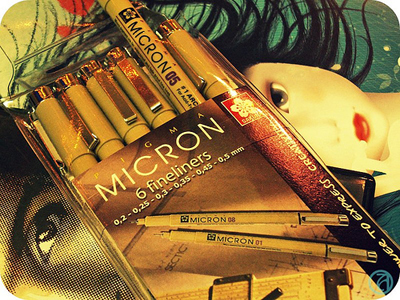
I draw in my pages after completing my sketches in Micron pens. They're really great, waterproof, archival pigment liners and come in a variety of widths. I'll talk about drawing next time, but these fine liners are a very important piece of kit to me.
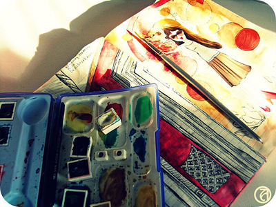
I use small tip brushes to blend the watercolors, or use a box of watercolors to blend in some more color. I have a small travel box of water color paints by the label 'Van Gogh'. I like it, but think it's very basic and any high end brand will do. The watercolors will form a nice base layer for the layer that comes next.
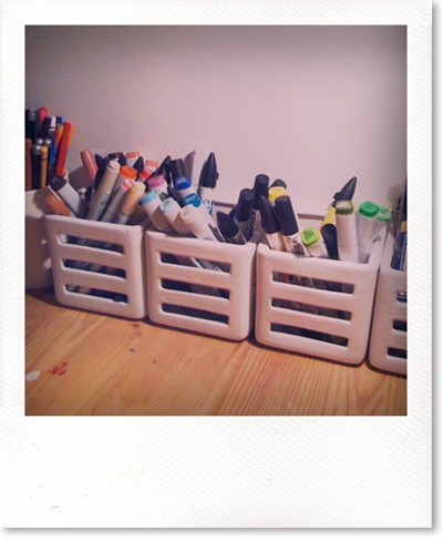
I have a large selection of Copic markers and ProMarkers. Both of them are water-based markers I really love. Actually, Copic markers are my favorite, but they're hard to get here and ProMarkers are just that bit cheaper.
I will top off the dried watercolors with another layer of color. I like the vibrant colors and the layered look of markers on top of the watercolors. The colors just come out that more vibrant. Also, given the crappy paper of the Moleskine daily planner I use, I kind of have to. Copic markers and ProMarkers will always bleed through pretty much any kind of Moleskine and somehow the dried watercolors are greasy enough (?) that it will stop the markers from bleeding through.
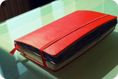
So yeah, we come to the final piece of 'kit' I use: the Moleskine. Of course many of you will be familiar with this Italian reincarnation of the famous notebook used by Van Gogh and Hemmingway. I like to use a large, daily planner, mostly because of the way the date is printed on the pages. Also, I like to keep my drawings all chronologically, in a book. It gives it an aura of importance to me. Of something big, a continuing project. But, to be honest, I usually advice people who start out to get a different notebook. The paper is just not that great, bleeds through, and the daily variety curls and gets wobbly when exposed to too much paint, watercolors, or ink. I do recommend, however, getting a nice book. For me, it's important to keep the drawings in something precious-looking. These are your stories! Treasure them!
Well, hope you enjoyed this part of the tutorial. Next time, I'll talk about drawing (and learning how to draw) and how to combine everything into one spread! Have a great Monday and please do let me know if this post was helpful to you!
