Art Journaling 101 - Part 3: Drawing and Putting It All Together
In the final part of this tutorial, I would like to talk to you about drawing and about how to put this together with all the things I’ve talked about in the previous two parts (topic, layout, colors, and materials).
I know for most of you the drawing part is the hard part. I think this is why most art journal courses you can take online focus mostly on collage, mixed media, and scrapbooking techniques (The girls over at Red Velvet Art have a pretty awesome art journal course going on right now). Now, I like that, don’t get me wrong. Like any crafty girl I love beautifully patterned papers and ribbons, but there’s something about drawing, actually illustrating my day that really works for me. I think it’s because I am a highly visual person, it feels more natural for me to draw it myself.
Now, before I actually start I would like you to consider two things:
1. I never went to art school and never took any classes, so I don’t have an advantage over you besides the fact that I’ve been drawing every day for the past four years. I think drawing is a skill you can learn by being patient with yourself and practicing.
2. Ask yourself: Who are you doing this for? Who are you keeping an illustrated journal for? I think in the end, you should be doing this for YOU. Sure, it’s loads of fun to share a pretty page you’ve made online and get nice feedback, but in the end, keeping a journal is a personal way of documenting your experiences. It will bring back memories every time you look at the page you’ve made - and for me, that’s what journaling is about.
So please give yourself permission to make mistakes and accept that things will not be perfect. You’ve probably come here because you like my drawings, but I can tell you on nearly every page of my journal I feel there’s something I could have drawn better and I'll give you an example in this installment!). We’re our own harshest critics and I think that’s just going to be what it is. Doesn’t mean it stops me from enjoying drawing or putting together my pages, or looking at those pages when they’re done. After all, it’s about documenting your experiences, not about being a professional illustrator or artist or whatever. Just have fun!
But yes, drawing is more fun with some basic steps, so here’s what I’ve learned!
Drawing and putting it all together
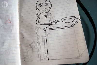
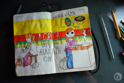
The topic... This particular day, I cooked my boyfriend a lovely dinner that I very much enjoyed making. Since this hadn't happened in a while (been too tired), I decided to draw about this. After I’ve determined the topic of my page I will think about what it was about that experience that stood out to me. 99% of the time it involves ME (since, hey, this IS my journal) and I’ll start with a sketch of a figure. I'll work in pencil first.
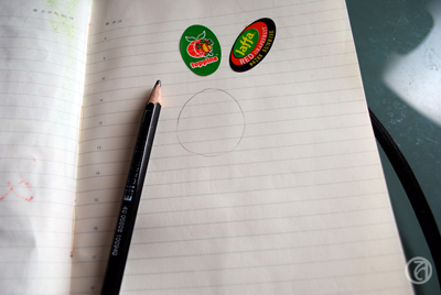
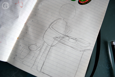
I sketch out the basic shape of the head first. I use some kind of egg-shaped head, but you can make it round, oval, whatever works. I then sketch out a bean-shaped form for the body. Of course this is all very anatomically incorrect, but it sure looks cute. The legs and arms are just little tubes sticking out. Depending on the subject I try to come up with a semi-realistic pose. Sometimes I check in the mirror what it looks like when I keep my hand behind my head or look at pictures. Where does the elbow bend? The wrist?
As you can see, I’m not sketching out the details yet, because I still want to be able to change things around if I feel it doesn’t work and too much detail just makes it more complicated. Getting the basic shapes right is my main priority here.
I then go on to fill in other elements in the drawing. Not too many, since I don’t like my pages to be too cluttered. What I’ve learned is that with just a few elements, you can already make a nice looking page that gets the message across. For example, in this case I could have chosen to draw the entire kitchen, but instead I chose to draw just the stove I made the food on.
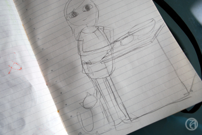
When I’m happy with my little ‘stick figure’ and the elements around the figure, I start drawing in the details. I'll start with the eyes, in this case just simple oval shapes. I try to get them to be the same in size and shape and on the same 'line'. I think this is the key to making your figure look good. Start by getting the outline right. If the eyes are not on the same level, or different in shape, just erase the one you don’t like and try again. When you’re happy with the position and the shape, you can draw in the pupil. I usually put them in the middle, because I like my figures to look at me, plus, it’s also pretty easy to draw when you’re a beginner. Even easier to draw are the closed eyes. Upward half moons usually give a happy impression, downward half moons usually give a peaceful impression (or sleepy, depending on the mouth). For the hair, be sure to place the top of the hair a bit above the skull you’ve drawn, unless you want your figure to look like she’s been standing out in the rain a tad too long.
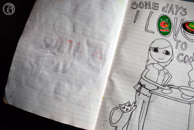
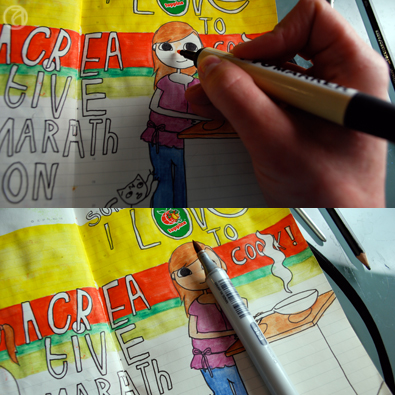
When I'm happy with what I've drawn, I will trace the final outlines with a fineliner. Now, I'm not an expert on perspective, but I am always sure to remember to trace the lines of the elements that are in front of the other elements first. You don't even want to know how often I made that silly mistake, just because I was focusing on getting every single shape perfect.
Next step is adding the text. I now do this without sketching out the letters first, but the first couple of years I always sketched them out first. And I probably still should, as I often find I misspell my titles just because I'm too focused on my lines instead of on the actual text. As you might have noticed, there were two grapefruit stickers on the page before I started drawing. I often just paste in little things like that on random pages so they'll surprise me when I get to that page and add a bit of spontaneity to the page. In this case, I used the stickers as part of the text.
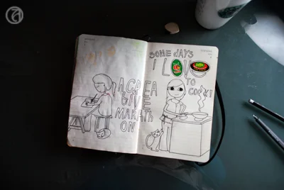
Usually I'll draw chronologically (starting on the left page first), but I was a little behind on my 'homework' and I worked on the left page after finishing the sketch on the right page.I decided at this point I would try to use the horizontal layout here, mainly because the topics are very different (the left page is about working on my art journal!).
The right page of this spread is very vertically oriented, and I attempted to compensate for this by adding the title of the page on the left more to the center of the spread. There's still not a lot of continuity between the two pages, though, so this will have to be achieve through color.
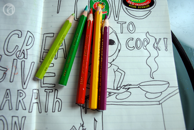
I chose the colors for this spread based on the stickers that were already there. Because I found the combination red/green/yellow a bit hard to work with, I visited the Kuler website and found a color combination I liked that includes those colors.
This one is called 'Mexican Spice' and it just stuck out to me because it's so cheerful and non-obvious. You can really see how awesome those Caran d'Ache watercolor pencils are, because I found pencils in my box that perfectly matched those of this Kuler theme!
To tie the two pages together I bit, I used one of the tricks I discussed in part one of this tutorial. I used a horizontally oriented background in the colors I just picked out . I decided not to go too wild (since the combination of the purple with the green, yellow, and red is already a little out there) and didn't use the purple in the background. Instead, I used the purple on a few items in the foreground.
I use a small brush to wash out the colors. I love this technique and love the smoothness of the pencils. Plus, I'm too impatient to perfectly color in every color block with regular pencils, so watercolor pencils work great for me.
As you can see, the colors are a lot brighter and smoother after the first wash.
Then, I use skin colored Copics and ProMarkers for the face, and various other colors to give all the color blocks an extra layer of color. I think this makes the colors really pop.
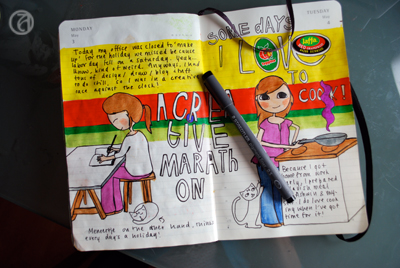
Almost done now! When I'm completely done with the colors, I trace over ALL the outlines with fineliner again. I don't like the 'dusty' look of the lines after I've used the watercolor pencils, so I want to make them a little more sharp. This is also the time to try and correct the mistakes I've made. Like in these two pages I completely messed up the hands (of course, I didn't sketch them out properly) and I tried to make it look a little better. I'm not sure it worked, but I'm not going to feel bad about it.
Finally, I add my journalling to the page. It's usually just a short story of what the page is about, but occasionally I'll add more details about that day (if more than one interesting thing I'd like to remember happened that day).
Annnnddd... you're done! I scan in all my pages and clean up the background before uploading the scans onto Flickr. It's fun to share! However, I have had periods where I wouldn't upload any scans, mostly because I lost track of who I was creating these pages for. It's so important to realize that journalling is for YOU, because this is really where the most rewarding experience takes place.
Okay... well... I hope I've answered some of your questions about keeping an illustrated journal and drawing. Do let me know if there's something else you'd like to know! Hope you had fun!
